
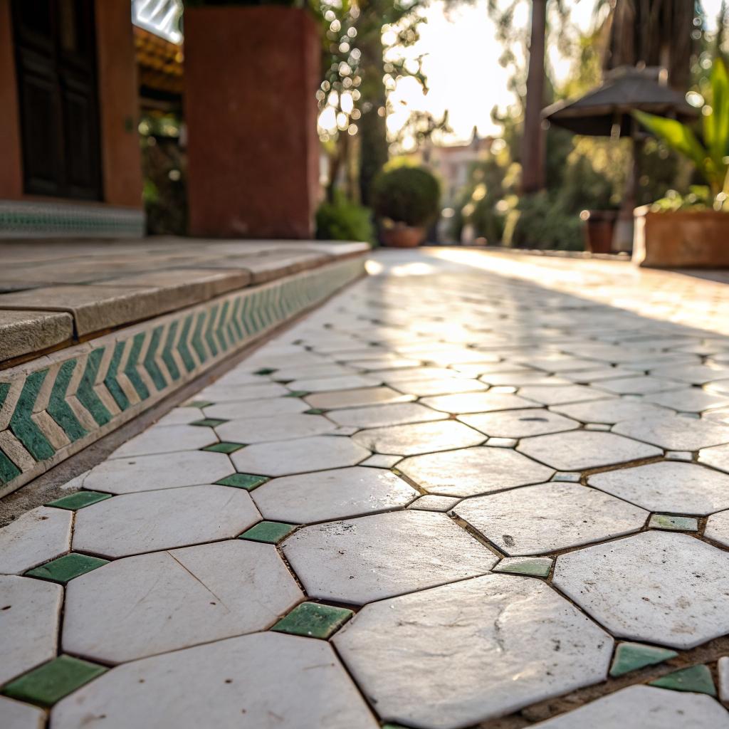
What if I told you that in a certain slice of tech, you can now guess a startup’s last funding round pretty accurately just by looking at their kitchen backsplash?
The short answer: warm white zellige tile has become the new status symbol for funded startups that want to signal taste, calm, and “we are not a WeWork clone” energy. It is the physical version of a clean product UI, the Allbirds of surfaces, and founders are quietly fighting their landlords and contractors to get it into their offices and their Zoom backgrounds. If you want the specific look everyone keeps screenshotting from design accounts, it is usually a handmade warm white zellige tile wall catching soft light on a messy but expensive coffee counter.
Why founders care about tile at all
If you are building software, tile probably sounds like a weird thing to obsess over.
But here is what I keep seeing in early stage offices and founder DMs:
Founders are no longer trying to impress investors with neon signs and swing chairs; they are trying to impress their own nervous brains with rooms that feel calm enough to think in.
After the open office era and the “free beer on tap” phase, a lot of teams are burned out on loud spaces that look like someone copied a Pinterest board from 2013. They want:
- Quiet surfaces
- Natural materials
- Things that age well instead of looking dated in 18 months
Warm white zellige hits that sweet spot:
- It looks minimal in screenshots and decks
- It feels textured and human when you are actually in the room
- It photographs very well for press and hiring pages
So the same way everyone once bought the same ergonomic chair that “real” companies had, a lot of founders now chase the same handmade tile that design-led startups are using.
What makes warm white zellige different from other tile
You can get white subway tile at any big-box store. It is cheap, flat, and predictable. You have seen it in a thousand rental kitchens and coffee chains.
Zellige is not that.
Quick primer on what zellige actually is
If you are still fuzzy on the basics, here is a simple overview.
| Feature | Typical ceramic tile | Zellige tile |
|---|---|---|
| Material | Standard clay blend, machine formed | Clay, traditionally from Morocco, hand shaped and glazed |
| Surface | Flat, uniform, consistent color | Uneven surface, small pits and ripples, tone variation |
| Edges | Perfect, symmetrical, repeatable | Irregular, chipped edges, each tile a bit different |
| Look in light | Predictable, almost matte | Reflects light in small shifts, feels alive through the day |
Warm white zellige is just zellige in a soft, slightly creamy white. Not blue white, not grey white. More like “sunlight on a wall at 4 p.m.” than “PowerPoint background.”
The appeal, especially for tech people who live in clean Figma files and systems, is that it is imperfect on purpose.
Every tile is a tiny exception to the rule, which is probably why product people love it: it feels like shipping a feature where no two users see exactly the same thing, but the experience still holds together.
How the “status symbol” part creeps in
Warm white zellige is not exactly cheap, and it is not instant.
You have to:
- Plan for longer lead times
- Hire someone who knows how to install handmade tile
- Accept that the wall will not look machine perfect
So when you walk into a startup office and see a whole kitchen wrapped in this tile, your brain does a quick calculation:
- They had the budget to care about finishes
- They planned early enough to specify the tile
- They had the patience to live with variation instead of defaulting to “builder grade”
That is status in the tech world right now. Not just money, but taste and patience.
The psychology: why tech teams like imperfect surfaces
Many founders say some version of the same thing: “Our work is abstract. We stare at numbers and screens all day. The office needs to feel real.”
Warm white zellige hits a few psychological switches that matter more than most people admit.
Soft white calms the room
Bright white walls can look sharp in photos, but they can also feel harsh. Especially under cheap LED strips.
Warm white reads as clean but not sterile, and the small color shifts from tile to tile keep the eye interested without shouting for attention.
Think of it as ambient detail: your brain registers texture and depth, but it does not pull focus from the work.
So when you are doing a late-night incident call in that kitchen, it feels more like a real home and less like a lab.
Handmade texture signals care
When a candidate or investor sees a handmade tile wall, their first thought is not “nice grout lines.” What they feel is “someone cared about this.”
That spills over, sometimes unfairly, into:
- “They probably care about the product too”
- “They think long term”
- “They are not cutting every corner”
Is that always true? No. Some terrible products live behind gorgeous walls. But people still make the connection, because humans read environments for clues.
If you think this is superficial, that is fair. A lot of office trends are. But surfaces and lighting shape how people behave, and founders pay for any small edge they can get in hiring and focus.
Backgrounds matter in the remote era
Here is a boring but real detail: until you have joined at least one board meeting where someone comments on a founder’s background, you might underestimate how often people notice backdrops.
Warm white zellige works on camera:
- It adds visual interest without pattern overload
- It handles different lighting conditions well across the day
- It makes cheap webcams look slightly better than they are
If you are recording product launch videos, user onboarding clips, or podcast interviews in-house, having one “hero wall” that just looks good in every angle is more helpful than it should be.
Where startups are putting warm white zellige
Not every team can retile an entire office, and not every landlord will allow it. That has not stopped people from getting creative.
Here are the most common spots where warm white zellige shows up in tech offices and founder apartments.
The kitchen that lives on Instagram
The standard move is a full-height backsplash behind:
- Espresso machine
- Filtered water tap
- Snack shelves
Sometimes it wraps onto a side wall or the front of an island. Teams shoot a lot of social content there: birthday cakes, small celebrations, those “we shipped” photos when a big feature goes live.
A flat, glossy tile would glare under downlights. Warm white zellige catches light more gently, which makes it forgiving when people shoot with their phones on auto.
The bathroom investors actually talk about
Second most common location is the office bathroom, especially the one near the main meeting rooms.
Founders will say they did it for team morale, but you also hear investors mention the bathroom on the way out, which tells you something.
Typical moves:
- Full zellige wall behind the mirror and sink
- Zellige in the shower zone if the office has one
- Soft brass or black fixtures against the warm white
You end up with this quiet, spa-like corner in a busy floor. People remember it. They should care about your dashboard; they talk about your bathroom.
Small focus rooms and phone booths
There is a subtle but smart use case here.
In a tiny call room, a crisp white drywall box feels cheap and echoey. One tiled wall:
- Adds depth so the room does not feel like a closet
- Gives you a better Zoom background than frosted glass
- Reflects sound differently than smooth paint, which can soften echo a bit
You do not need much. Even one 2-by-2 meter section can do the job.
Warm white vs cool white: why that exact shade matters
If you look at enough reference photos, you will start to notice that some “white” zellige reads grey and some reads almost beige.
Founders who get it right pay attention to:
- Lighting temperature
- Natural light levels
- What sits next to the tile: counters, cabinets, stainless, concrete
Here is a simple comparison.
| Type | Look in real life | Where it works |
|---|---|---|
| Cool white zellige | Clean, slightly blue or grey in some light | Very bright offices, minimal black-and-white schemes |
| Warm white zellige | Softer, gentle cream tone, cozy but still modern | Most startup kitchens, mixed materials, wood, concrete |
Many tech spaces sit in older buildings with mixed light and weird shadows. In those spaces, warm white tends to be more forgiving.
If your lighting is mainly cool LEDs and glass walls, cool white can look sharp but also a bit cold. The current taste leans to environments that feel more relaxed, which is why the warm shade wins.
The “founder Pinterest board” pipeline
No one wakes up and says “our moat is tile.” So how did this turn into a status marker across startups?
The path looks something like this:
1. Someone visits a boutique hotel on a work trip
A founder stays at a small hotel with handmade tile everywhere. They feel strangely calm while answering emails from the lobby and think “our office should feel like this, not like a co-working space.”
They save photos. They ask the front desk what the tile is. They do not remember the word “zellige” yet, so they google something vague like “handmade wavy white tile.”
2. Instagram, Pinterest, and design blogs do the rest
The algorithm feeds them:
- Moroccan bathrooms
- Quiet kitchens with textured backsplashes
- Minimal offices with one tiled wall
Before long, their “new HQ” board is 40 percent warm white zellige. It has become the visual shorthand for taste.
3. Contractors push back, which increases the status value
When they finally go to build, several things happen:
- Contractors warn that handmade tile will take more time
- Some say it will look “crooked” or “wrong” compared to standard tile
- Lead times might be longer than generic stock
Any time something is a bit harder to get and needs more explanation, people with money and patience use it to separate themselves from those who do not bother.
That is how status symbols form. Scarcity, plus taste, plus small frictions.
Numbers: is this actually worth it for a startup?
Here is where I think some founders get carried away.
No investor will write a term sheet because you installed nice tile. But the space you occupy can influence:
- How many days people actually want to come in
- How comfortable candidates feel during on-site interviews
- How credible your brand looks in photo and video content
Is that worth thousands of dollars in tile and labor? For some teams, yes. For others, probably not.
Think about the rough order of magnitude.
| Choice | Material cost | Install complexity | Visual impact per square meter |
|---|---|---|---|
| Plain white subway tile | Low | Easy, any tiler | Moderate, feels generic |
| Painted drywall | Very low | Very easy | Low, especially in busy spaces |
| Warm white zellige | Medium to high | Needs some skill and time | High, reads premium in photos and in person |
If you are spending significant money on an office build, the upgrade to zellige on one or two key walls can be a small percentage of the total, but a large percentage of what people actually notice.
I do not think every bootstrapped team needs this. If your runway is tight, a gracious space with plants, good chairs, and decent coffee matters more than any tile.
But if you are already paying for a prime location and custom furniture, then skimping on the surfaces everyone sees every day feels like odd prioritization.
How to make warm white zellige actually work in a tech space
The fastest way to waste money is to specify a nice material, then surround it with random choices.
Some practical tips that come up repeatedly when founders debrief their builds.
Coordinate with lighting first, not last
Warm white zellige looks best when:
- Overhead lights are in the warm to neutral range, not icy blue
- There is some sideways light grazing the surface to catch texture
- There are no single harsh spotlights creating hot circles
If you can, aim for layered lighting:
- Soft overhead grid
- Under cabinet strips in kitchens
- One or two wall washers highlighting the tile plane
People often pick the tile, then throw any lighting on top. That is backwards. The whole point of this specific tile is how it plays with light, so treat lighting as part of the product, not an afterthought.
Contrast with at least one strong material
Warm white zellige looks slightly dull if everything else in the room is also soft and beige.
You get better results when you pair it with something that has presence:
- Black fixtures or cabinet pulls
- Dark stone or quartz countertops
- Concrete floors or simple pale wood
The contrast makes the tile read as intentional, not just “the default white.”
Accept irregularity instead of fighting it
Many founders I talk to admit they panicked when they first saw the tiles out of the box. Some are a bit thicker, some a touch darker, some chipped on the edge.
That is how it is supposed to work. If you instruct the installer to “make it all perfectly level and uniform” like machine tile, they might:
- Sort out variation and cluster similar tiles, which actually looks worse
- Try to grind or shave tiles to flatten them, which defeats the point
Better approach:
- Mix tiles from several boxes as you go
- Step back regularly and check that color variation feels balanced
- Live with slight lippage and small chips; they are part of the character
When warm white zellige is a bad idea
You asked for honesty, so here it is: not every startup should chase this.
Situations where I think it is a poor fit:
- Your office lease is short and your landlord will not share build costs
- You do not have a reliable contractor who has worked with handmade tile
- Your brand is deliberately high-tech and glossy, with lots of stainless and RGB lighting
Also, if your team cannot keep a kitchen reasonably clean, a beautiful backsplash behind overflowing sinks and sticky counters will not impress anyone. It will just highlight the mess.
Some founders try to fix culture with furniture and finishes. That usually fails. Good tile can support a culture that already exists; it cannot create one.
What this trend says about where startup culture is heading
Trends in physical space usually lag cultural shifts in the tech world by a few years. For a long time, the look was:
- Exposed brick and ducts
- Large neon company logo
- Long tables, no focus rooms
It screamed “energy” and “we are always on.” It also screamed burnout.
Warm white zellige and similar choices suggest a different set of values:
- Calm over hype
- Longevity over disposable decor
- Texture and material honesty over shiny finishes
In a way, it matches how product strategies have shifted. Less “move fast and break things,” more “ship fewer features, but well considered.”
Some founders push back on all of this and say “we just picked the tile because it looked nice.” That can be true on the surface. But when a lot of people across markets make the same “random” choice at the same time, something deeper is usually going on.
Q&A: Common questions founders quietly ask about warm white zellige
Q: Is it hard to maintain in a busy office kitchen?
A: Normal use is fine. Wipe splashes quickly, use a gentle cleaner, and seal grout if needed. The glaze on zellige is quite resilient. If you expect constant abuse, you might want a slightly darker grout so coffee stains are less visible.
Q: Will this look dated in a few years?
A: White handmade tile has been used for a very long time in homes and public spaces. Unlike some trends with aggressive shapes or colors, warm white tends to age more slowly. It may stop being a “status symbol,” but it is unlikely to look embarrassing.
Q: Is this really a smart use of runway?
A: It depends on your stage and how heavily you use your office. If your team is mostly remote and you rarely host people in person, then no, I would not treat tile as a priority. If you are building a strong in-person culture and using the space daily for hiring, press, and content, investing in a few standout surfaces can make sense.
Q: Can I get the same effect with cheaper tile?
A: You can approximate the look with textured white ceramic wall tile, and some people will not notice the difference in photos. In person, though, handmade zellige has a depth and randomness that standard tile does not quite copy. You have to decide whether that nuance matters for your use case.
Q: Should this influence our brand design?
A: In a small way, yes. If your physical space leans into warm white, texture, and calm, then harsh neon gradients and ultra-tech visuals on your site may feel disconnected. Many design-led startups treat the office as another brand touchpoint, not as a separate world.
If you walked into your own office for the first time, with fresh eyes, would the tile on the wall tell the same story as the product on your screen?